How whitespace can change how people feel, read, and act
There’s onboarding info to cover, compliance updates to announce, learning links to share, internal events to promote, and that’s just Monday.
It’s no surprise that HR pages fill up quickly. But when every inch is packed, employees don’t engage more. They disengage.
That’s where the power of space comes in.
Why space matters
Whitespace isn’t empty. It’s what helps everything else shine.
There are two types of whitespace, and both matter:
- Active whitespace is used intentionally. It helps guide the viewer’s eye, highlight key elements, and create structure.
- Passive whitespace happens naturally, like the space between lines or around a heading. It gives content breathing room and improves overall aesthetics.
Used well, whitespace can:
- Highlight the most important messages
- Improve scannability and accessibility
- Help pages feel less overwhelming
- Increase clicks and interaction
- Create a more professional and cohesive branded look
Research published in the International Journal of Novel Research and Development (IJNRD) emphasizes that whitespace doesn’t just improve visual design. It also supports emotional engagement and comprehension, making it easier for people to stay focused and take action.
The question we hear most: “Can we keep everything above the fold?”
This concern comes up all the time. There’s a common belief that employees won’t scroll, especially when internal messages are time-sensitive.
But here’s the truth. People are used to scrolling. What they won’t do is scroll through clutter.
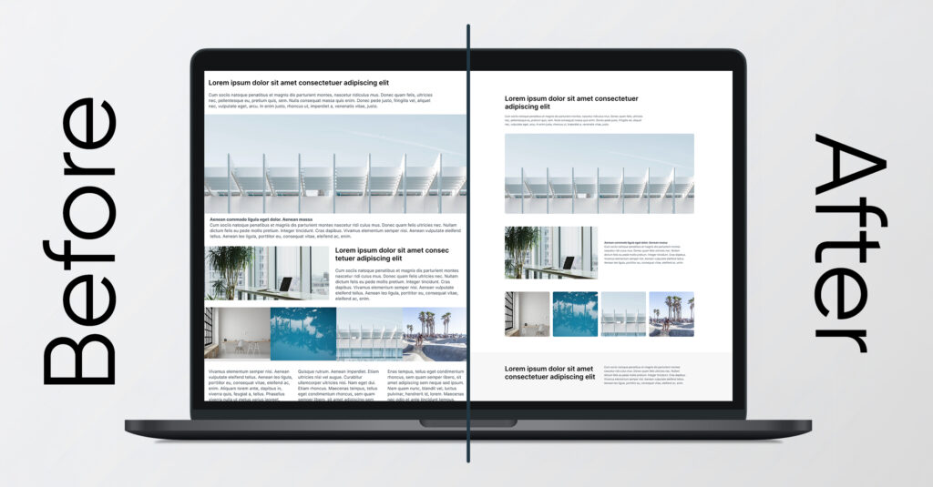
Trying to squeeze everything into the top section of a page often has the opposite effect. It makes content harder to follow, hides key actions, and creates a sense of overload.
Pages that are structured well, with clear flow and room to breathe, encourage people to keep going. When the design is intuitive and calm, scrolling feels effortless.
Text walls
Without breaks or visual structure, even the most important message gets ignored.
Banner overload
When everything tries to grab attention, nothing actually stands out.
Overstuffed layouts
A few extra sections quickly become a confusing pile.
Mobile crunch
Designs that look fine on desktop can feel overwhelming and messy on a phone.
Designing with space in mind
These small changes can have a big impact:
- Break up long paragraphs with headers, bullets, and spacing
- Add consistent padding and margins so each section has room to breathe
- Focus each section on one message or action
- Let the most important content lead, rather than trying to show everything at once
- Design for scroll by creating a natural reading path
Research from the Nielsen Norman Group describes a common behavior called the layer-cake scanning pattern. Users move through a page by scanning headings, not reading line by line. Pages with clear structure and visual hierarchy help people quickly find what they’re looking for and understand what to do next.
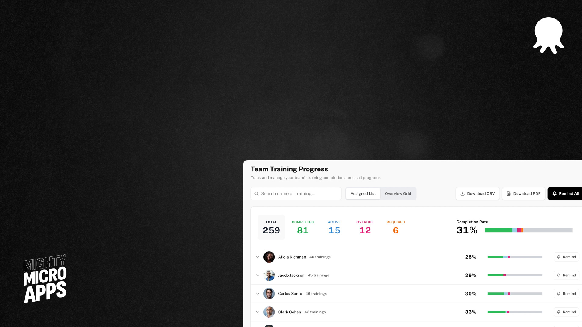
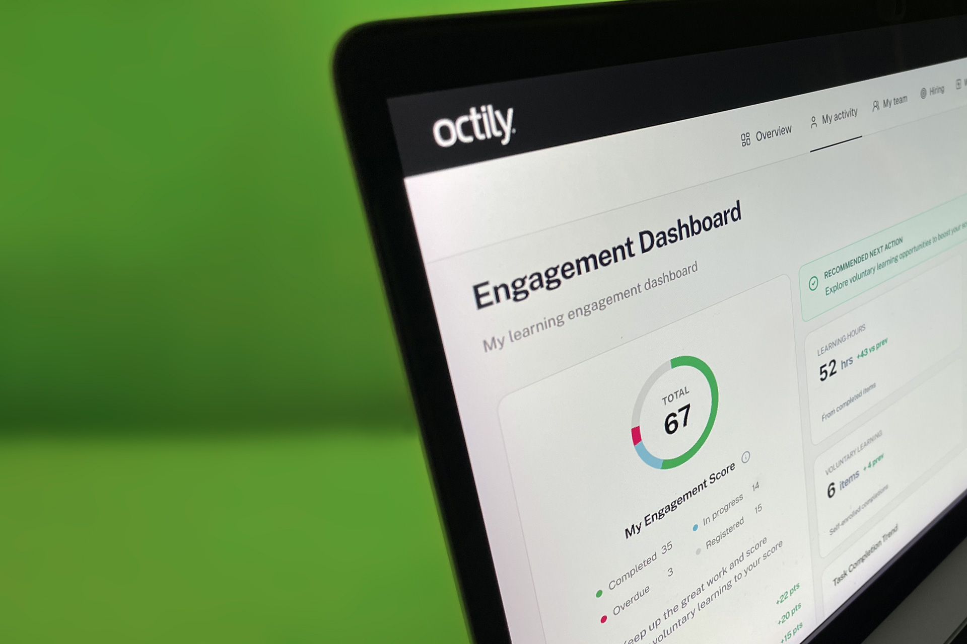
Well-structured content with whitespace doesn’t just look better. It makes your message easier to absorb and your page easier to use.
The result:
Calm, clear, and effective
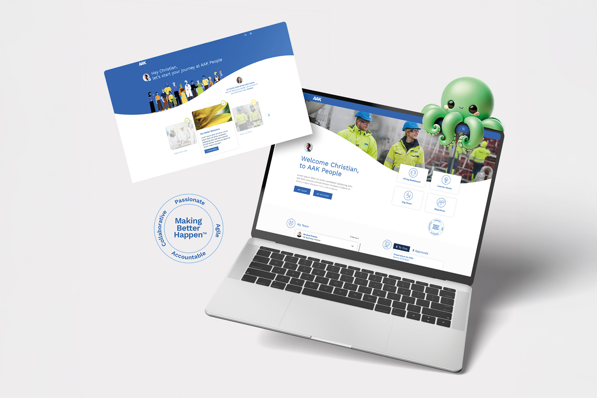
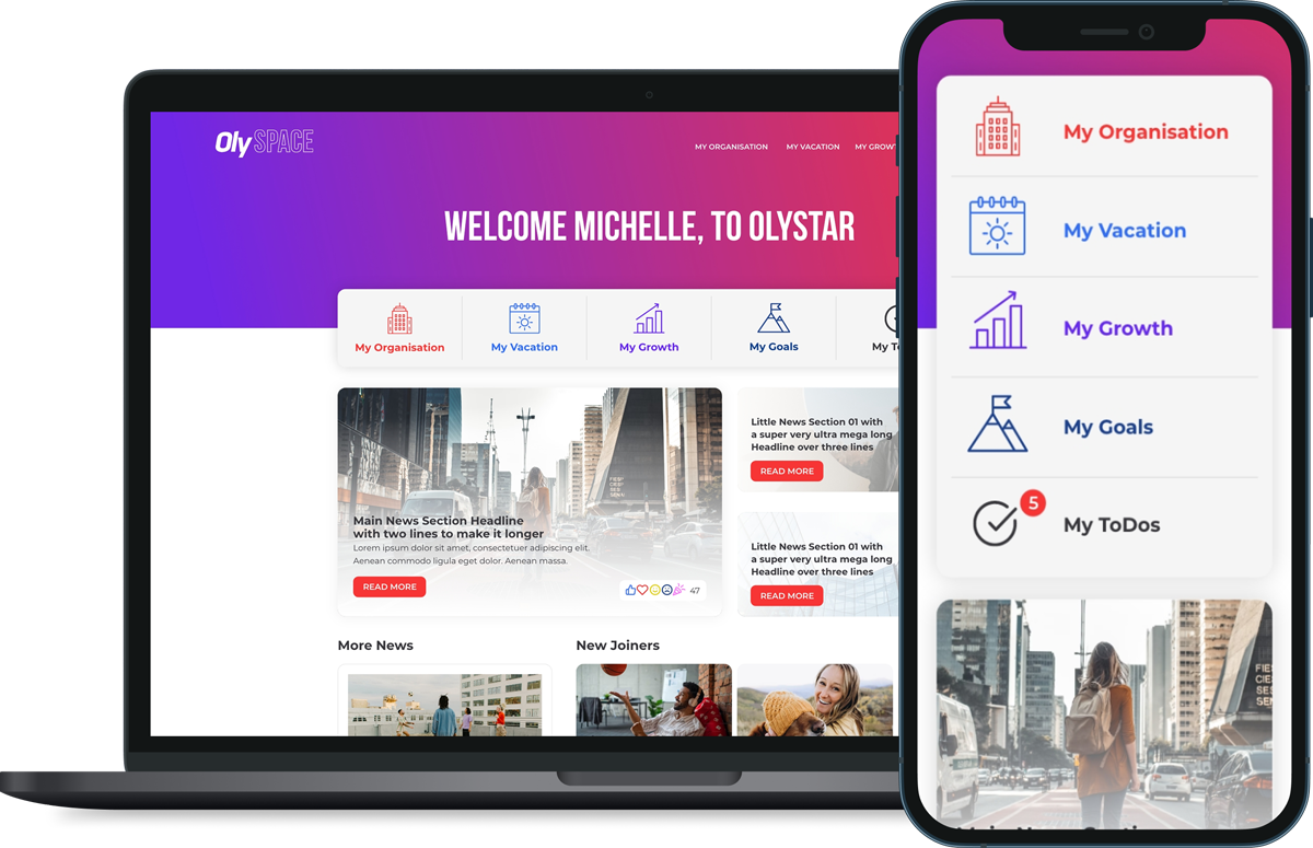
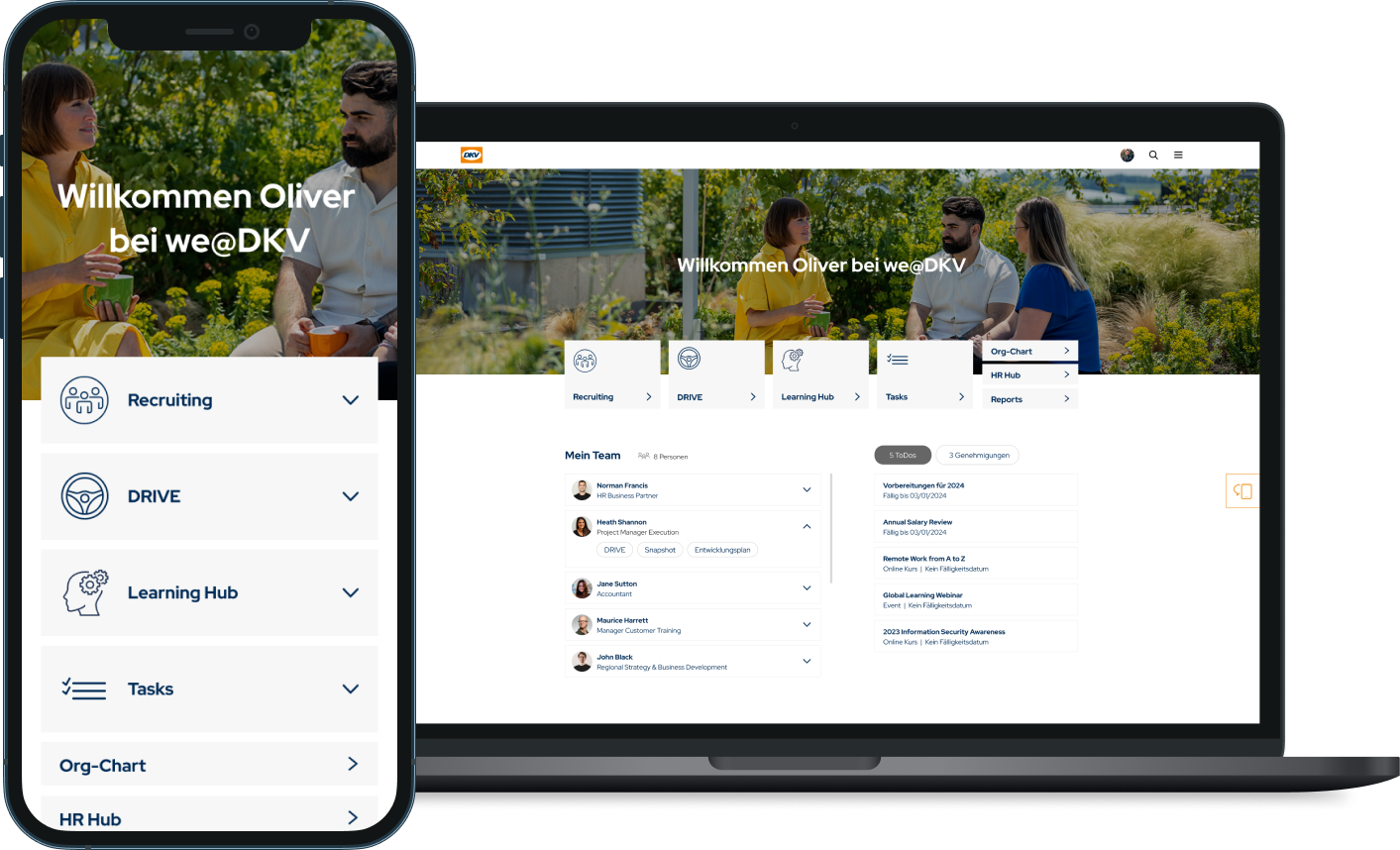
We’ve worked with many HR teams using Cornerstone CSX, EdCast, and Saba Cloud to simplify busy pages. In many cases, the content stayed exactly the same. What changed was the layout and the space around it.
Making space work for you
In HR, it’s not just about sharing information. It’s about encouraging action.
You want people to click the link, join the session, read the update, or watch the video.
Good design doesn’t just make things look nice. It helps your content work harder.
And giving your page some breathing room is a great place to start.
So don’t fear white space. Use it to your advantage.
It’s not empty space. It’s what supports everything else.
Need a second pair of eyes?
Anna, our design lead, has helped dozens of teams create layouts that guide employees through content without overwhelming them.
She can’t work to work on the designs for your pages.

White space is not wasted space, it’s where meaning finds clarity.
Ready to embrace the white space?
Let’s redesign with space, flow, and focus.
A better designs means a better experience and better results.
More clarity. Less stress. And higher completion rates.
Curious what that could look like for your team?
Get in touch, send an email, or book a meeting. We would love to explore what we can create together.